Patrick Caulfield/Gary Hume – review
Tate Britain, London
 Email
Email
‘A drama without actors’: After Lunch, 1975 by Patrick Caulfield. Photograph: the estate of Patrick Caulfield
Patrick Caulfield and Gary Hume make a fine pair at Tate Britain: two English painters who created something exhilaratingly new with their medium. Each has his distinctive look – Caulfield's snug black outlines and pure colour, Hume's shapely hard-gloss minimalism, equally flat – and both have been accused of appearing excessively stylish or laconic. But the value of this back-to-back presentation, two shows for the price of one, in adjoining galleries, is that one sees the opposite instead, just how deeply each of these painters is (or was) concerned with atmosphere and mood.
Caulfield died in 2005, at the age of 69. His art was a drama without actors, played out in interiors where some past or future action is silently condensed. These might be bars, foyers, hotel rooms or entire restaurants deserted between sittings of lunch and dinner, but he could set the human scene with a single still life.
In Candle-lit Dinner (1981), the chicken kievs lie cooling on their platter, the watercress wilts and the flowers are beginning to droop. Neither lover has shown up for the date. But the candle is still burning as if the dinner itself has been stood up.
In the aftermath of the office party, the typewriter sits forlornly intact among the wreckage of drained glasses, blank bottles and brimming ashtrays. The telephone has been shoved aside, painful reminder of tomorrow's working day. Inserted into the background, as if seen through a window, is a dreamy view of Spoleto: a conversation that took place earlier, perhaps, or a romance that will never now happen.
The remarkable thing about these vignettes, complex, anticipatory, elegiac, is that they are rendered with all the deadpan flatness of a DIY manual. Caulfield started out in the design department of Crosse & Blackwell. Before national service and Chelsea School of Art, he was a close student of cartoons, London pub signs, Edward Hopper and the posters of Toulouse-Lautrec. The first painting in this display shows a graphic blueprint of a house floating jauntily on a Mondrian grid. Perched on top is a tiny self-portrait composed of little more than an oval and some expressive punctuation (from which the entire career of Julian Opie might be deduced). By 1963 the humour and the black outlines had set in.
Caulfield began by drawing in the props with unerring skill – a table, a lamp, a bunch of grapes, their shapes essentialised in concise black outline. His paintings carry some of the simple pleasures of colouring in. He dropped the outlines in the 80s, perhaps irritated by comparisons with Roy Lichtenstein, depicting objects as silhouettes, templates or scrapbook details, like the chocolate-box roses that appear in Still Life: Mother's Day alongside the telephone that may or may not ring. Decor appears collaged in architectural drawings where only the salient details are included. The mechanics are openly declared, yet the effect remains mysterious.
 Café Interior: Afternoon, 1973. Photograph: © the Estate of Patrick Caulfield. All rights reserved, DACS 2013
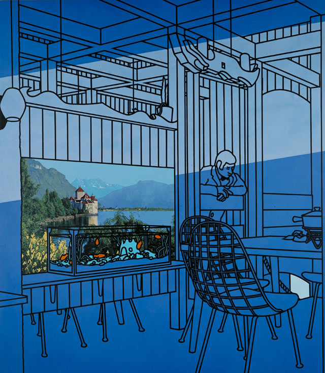
In Café Interior: Afternoon, 1973he is struck by the plangent interior light angling through the slatted blinds, and paints it in long blue shafts. In the cinema foyer he notices the dismal shades of lime and chalky mauve that describe this transitory limbo. In Paradise Bar, a diagram of bamboo stools and cane trellises bearing fake vines, the whole space – the whole picture – is painted a pervasive infrared; a darkroom awaiting some development.
You know where you are with Caulfield. Walk round this show without consulting the labels and the pictures put you on the spot. You are in a Spanish restaurant where the bull's head hangs dead on the wall; you are in France with the woodwork and liqueurs. You are in an Alpine-themed restaurant in the 70s where the fondue sets wait empty on the tables and the waiter is so bored he seems to have fallen asleep over the timbered half-door.
On the back wall is a poster of the Danube meticulously rendered in all its advertising hues; in front of it a tank of outlined goldfish reprised in homage to Matisse. This is a place of melancholy artifice, a concatenation of assorted pastiches; and picture is a kind of sight test – how to read the visual signs in art as well as life.
Did Caulfield love the lino and Formica of his chosen interiors? They were all made by his fellow man, he said, and that was the point. But like the deliberate banality of Magritte's backdrops, these familiar settings are always charged with something less ordinary.
There is even a Magritte sight gag in the majestically beautiful Dining Recess, a bright light dangling in a darkened room; or rather, a disc of warm white colour that illuminates nothing around it. The scene is otherwise uniform grey. The paint itself is the light.
Caulfield could paint the surfaces and spaces of modern life like nobody else, from flock wallpaper to stainless steel, from the textures of fibreglass and woodgrain to the stiff tendrils of a dying spider plant and the weave of a basket chair. He could do it in so many different idioms, sometimes all at once, that his pictures are a constant adventure for the eye. They are always alive to the paradox of picturing the world in two dimensions on a flat surface, but they reach beyond illusion every time.
The late works depict the last drink, the empty seat, the locked drawer and the exit sign above the bar. The shadows are growing longer, though the light may be even brighter. The intimations are all of mortality.
To enter his show, you have to push through a pair of Gary Humedoors, those big paintings in gloss on board that made his name and which look (and in this case act) exactly like doors. They may not seem like much of an idea now, any more than the shiny Red Barn Doorinside, which is nearly indistinguishable from the objects it depicts, and thus descend directly from a whole tradition of American art – Warhol'sBrillo Boxes, say, or Jasper Johns's flags – but they remain catnip for collectors.
This small and succinct survey of Hume's highly successful career has some of the popular paintings from the past 20 years, of songbirds, snowmen, babies and languid girls. All are made with his usual method, enlarging the source material – which might come from pictures, photographs or drawings – with the aid of a projector and then filling in the simplified shapes with pools of household gloss. These pristine surfaces, hard as chrome bodywork, irresistibly invite the touch.
 ‘Unsettling’: Gary Hume's The Moon, 2009. Photograph: Private collection © Gary Hume
But Hume has chosen a darker mood on the whole, nothing too lyrical or easy on the eye. In The Moon, for instance, it takes a few moments to register the huge, owlish eyes very faintly incised in the shadowy surface of the painting, eyes that stare sightlessly back at you. And then it takes a few more moments to realise that they obscure a lunar shape behind them. It's an unsettling picture in which everything seems to be on the verge of disappearing: the very condition of the night.
That sense of images slithering out of eyeshot (or grasp) is very prevalent. The Whole World looks at first like some enormous magenta blossom, chrysanthemum-petalled, and then again as veined, like an internal organ removed from a body. The liquid gloss suggests blood. It is one of Hume's characteristically ambiguous double images – duck-rabbit style – in this case deepened by the outer darkness surrounding the motif. For how can one begin to depict our global life?
This is a tougher, wiser sort of show from Hume. One painting of a girl – sunken-chested, slack-shouldered – is even titled Older, and there is a work entitled Angela Merkel that appears to show a great mouth in mid-speech, though the shrill lemon and green seem to carry more aggressive tension than the shapes themselves. It is always hard to read the tone of Hume's work and that uncertainty is increasingly crucial to an artist who never shows his hand.


More on this story
- With the Turner-nominated artist the subject of a Tate retrospective, we've gathered together some of his most notable works


No comments:
Post a Comment